
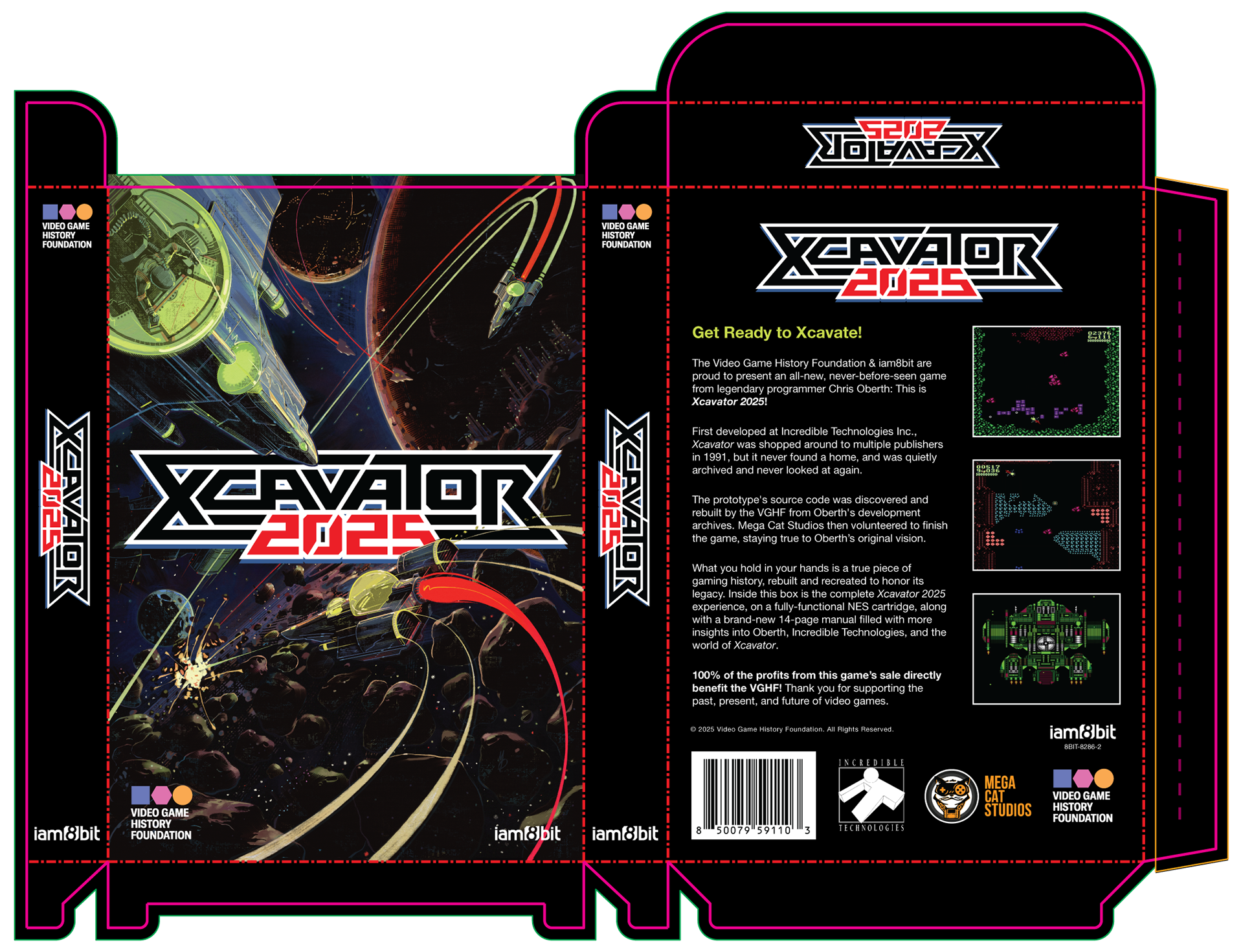
My goal was for the package to look so authentic that retro gamers might mistakenly believe it was legitimately designed between 1988-1990. You can read about my process for creating the logo and deciding on the front cover placement here.
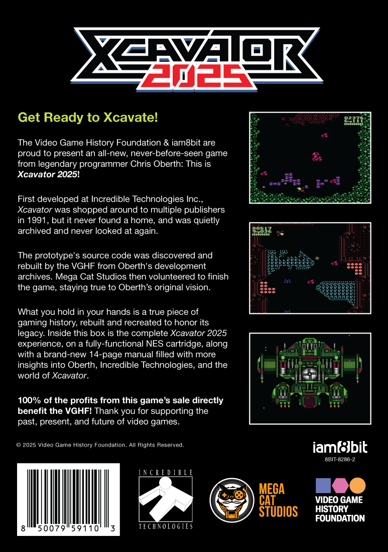
The main challenge for the back of the box was to make it feel authentic while also including logos for four different developers and publishers, something that simply wasn’t done back then. (Fun Trivia: Incredible Technologies allowed us to use the company's '90s-era logo to lend to that feeling of authenticity.) At the same time, games tended to include a lot more copyright information, and a big Nintendo Seal of Approval. Slotting the logos into the empty space where the copyright and seal might go sort of balanced things out, resulting in a design that I hope doesn’t feel too anachronistic.
However, when I started designing the box, the text hadn't been written yet. I told Frank it’d be hilarious if the subhead began “In the Distant Year of 2025…” He agreed, but by the time the text was written, things went in a different direction. I later reused this line for a faux magazine ad I threw together just for fun.
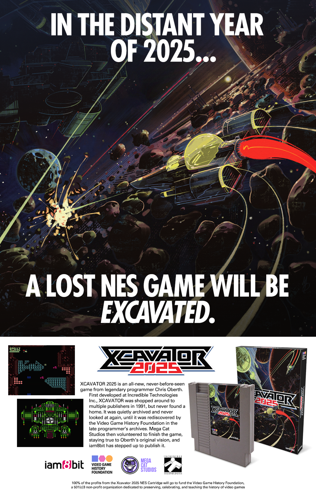
I created this not just because I love designing retro magazine ads, but because it seemed like a fun way to show people the portion of Max58’s cover painting that normally gets covered up by my logo. The crowded and haphazard bottom section was inspired by Konami ads from the era, and also gave people an early glimpse at the cartridge design.
The cartridge label is in some ways more important than the box. Think about it: Plenty of kids (or their parents) threw the box away as soon as it was opened. As a result, loose cartridges were much more common than boxed cartridges, so the label was the piece of design people were more likely to see.
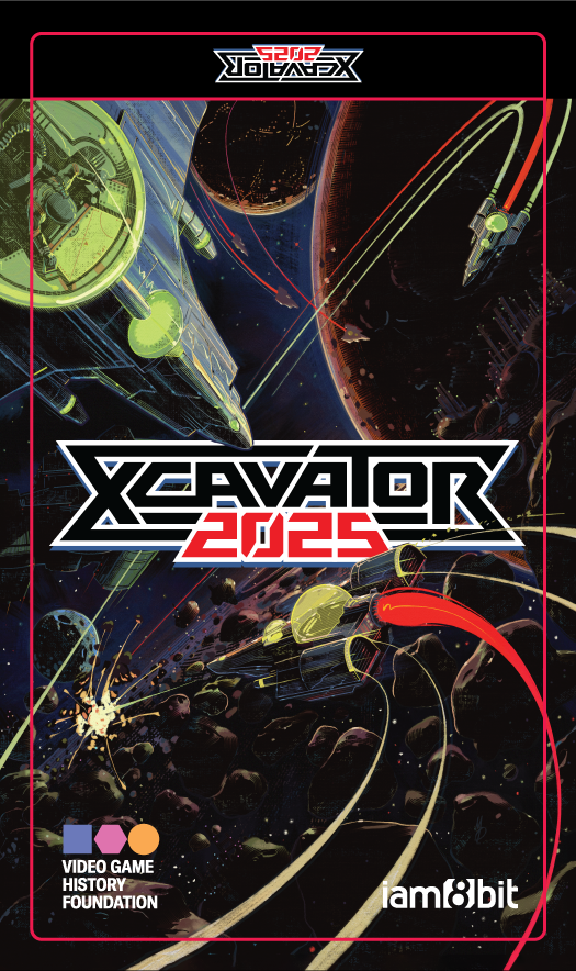
The challenge in designing the cartridge label is that it’s much taller and thinner than the box dimensions. Many designers would “cheat” and fill the top or bottom with a flat color to extend it, but thankfully Max58’s art was flexible enough that I could just trim off the sides and shrink the logo to fit.
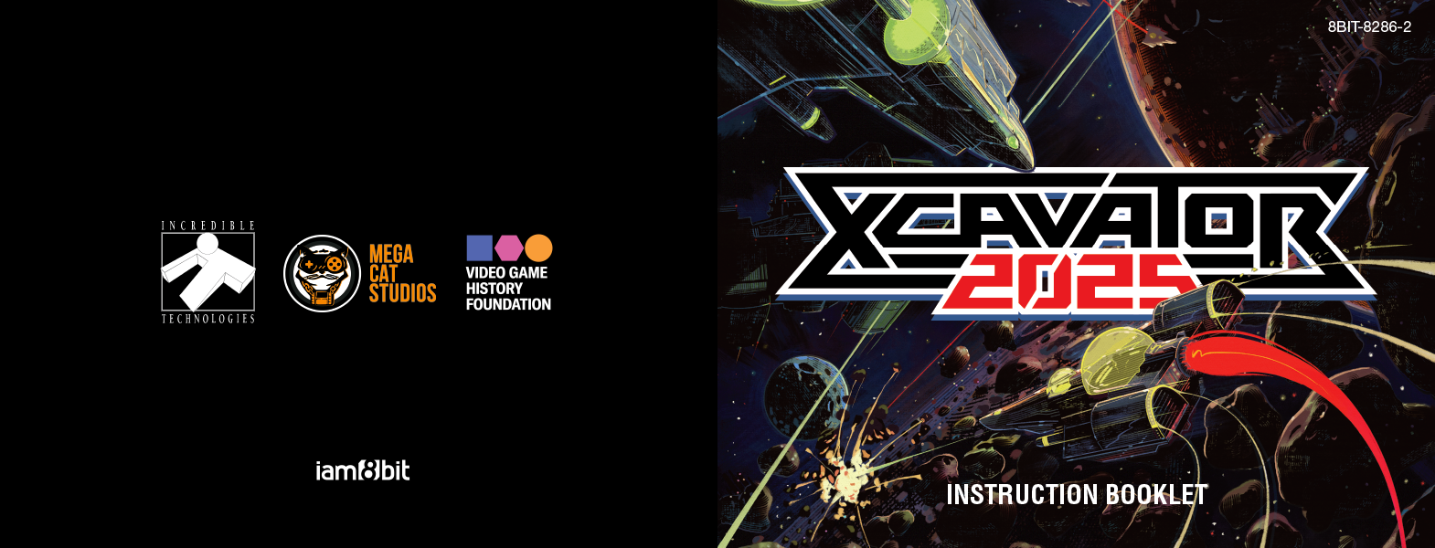
The instruction manual presents the reverse challenge, fitting the art into space that’s wider than it is tall. A great deal of visual information was cut off here, but by nudging the art up to put the focus on the ship and nudging the logo down to feel a little more balanced, I was able to make it work. The changes to the logo sizing and placement in each format are so subtle that the average viewer probably never notices.
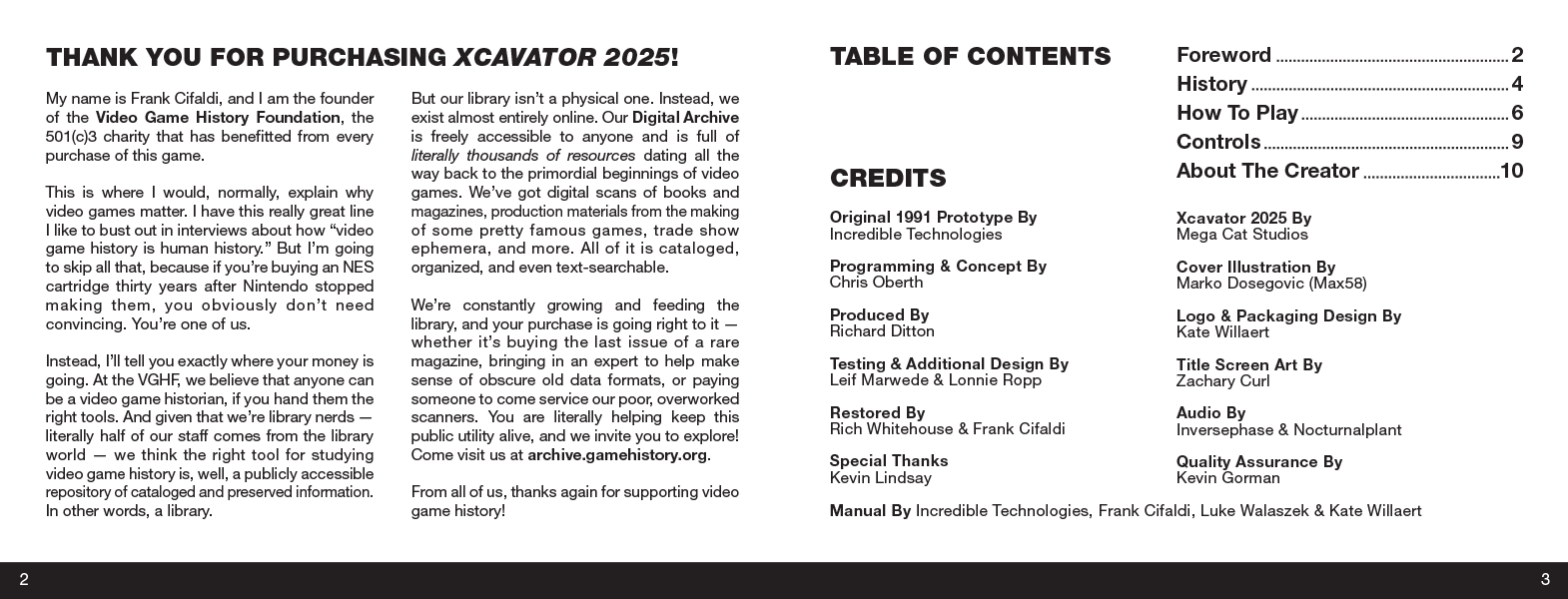
Iam8bit was originally going to create the manual internally, but I’m glad they outsourced it to me, because I love designing text pages and rarely get the chance to do it. In some ways this was the most fun of all the pieces to design, even if it’s visually the least flashy, on top of being the least looked at — collectors who keep their game sealed will never see it.
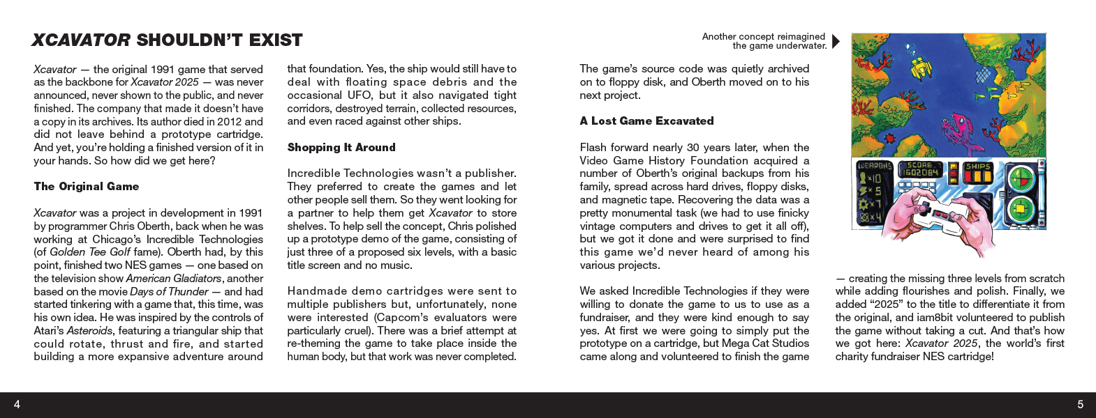
The convenient thing about my having parallel careers as a writer and an illustrator is that I’m able to pinch hit where necessary, which I find enjoyable, but also stressful when there’s a tight deadline.
My non-design contributions included writing half of the subheads, writing all of the captions, choosing which images to include and where, and lightly adapting the text from the pitch document to be more accurate to the final version of the game.
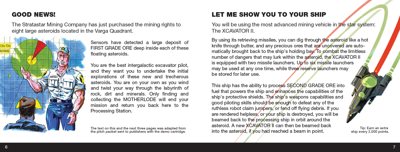
All the biographical articles were written before I started the manual, but beyond that most of the editorial decisions were left up to me. It was my decision to include the lore from the original pitch document.
The illustration on page 6 was from a later pitch to turn XCavator into an underwater game, but the setting was vague enough that it still worked. The ship on page 7 is a detail from Max58’s cover art that I thought would be fun to have the text flow around, even if it’s a Roid Racer (from the racing mini-game) on a page describing the XCavator II. In a funny way, the “mistake” just makes it feel more authentic.
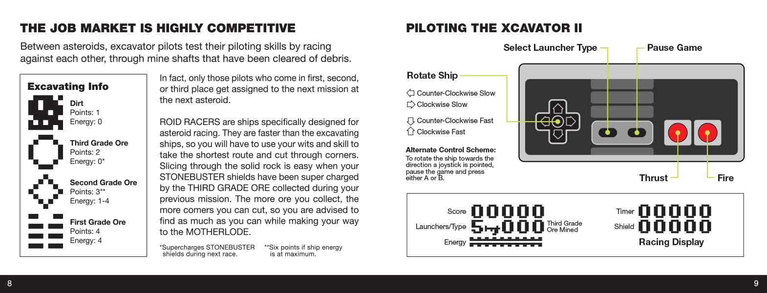
This is the spread I was looking forward to designing the most, because I love organizing complex information to be more visual and easier to read. Compare the above layout to how it was originally presented in the pitch document:
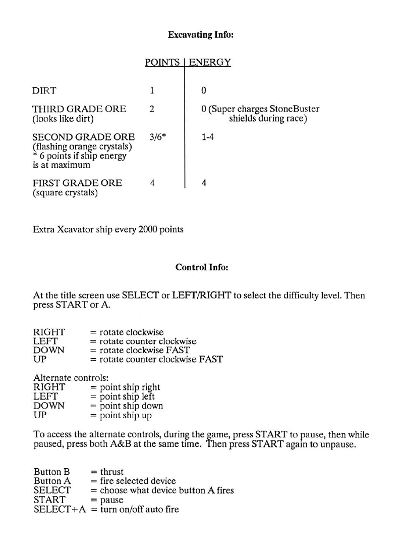
One thing the pitch frustratingly never explained was what the different devices/launchers in the game do, despite spelling out how to select and fire them. I honestly wouldn’t be surprised if they were intentionally going to leave it a mystery so it could be included in the “tips & tricks” sections of various magazines — a not uncommon tactic back then to get free promotion.
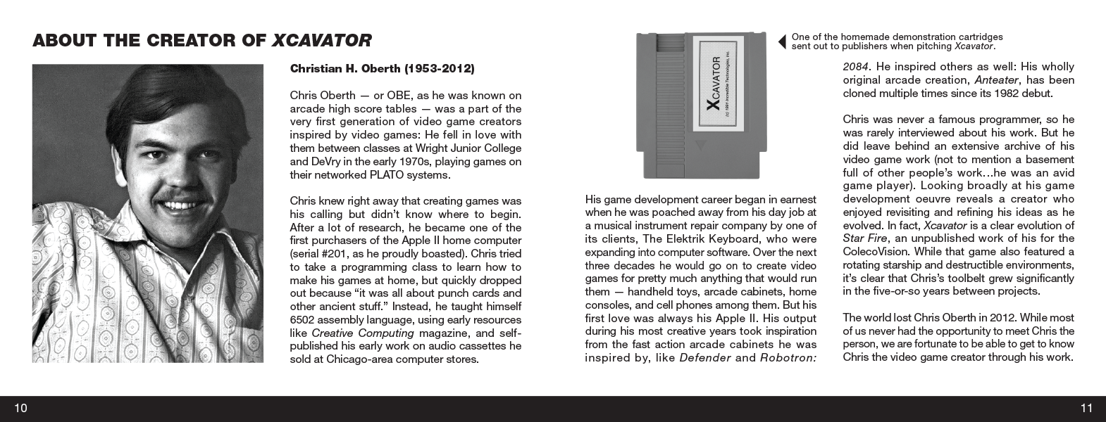
A few eagle-eyed readers have already pointed out that the manual is numbered to 12 (including the front and back cover, as NES manuals tended to do), yet the back of the box advertised a “14-page manual.” The reason is that stapled booklets always need to be divisible by four, and we didn’t have enough content to fill 16 pages.
However, if I’d had more time, I would’ve loved to have done this:
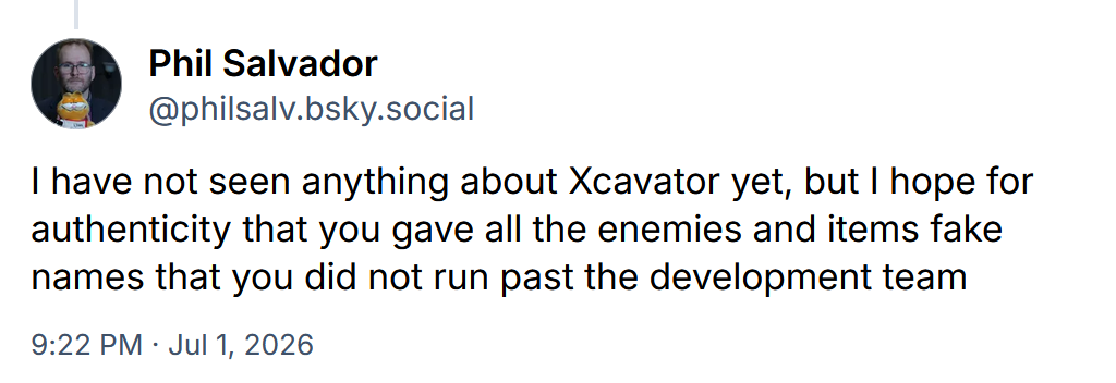
You mean I could’ve named the enemies and items after favorite rock musicians or comic characters, and created a little off-model illustration for each one, and people would’ve accepted it in the name of authenticity?
Instead we only got a few authentic errors, like none of us thinking to change the “14-page manual” line on the back of the box. I did catch one error in the in-game credits while doing the manual credits, but too late for it to be corrected. (The cover artist was not Max Gillis.)
But what did retro gamers think of the overall package? Did it look authentic?

Mission accomplished?