
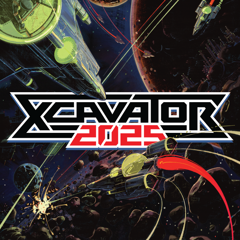
After the game's announcement, several design-conscious retro gamers gushed over the logo's design, with a particular focus on the diagonal.
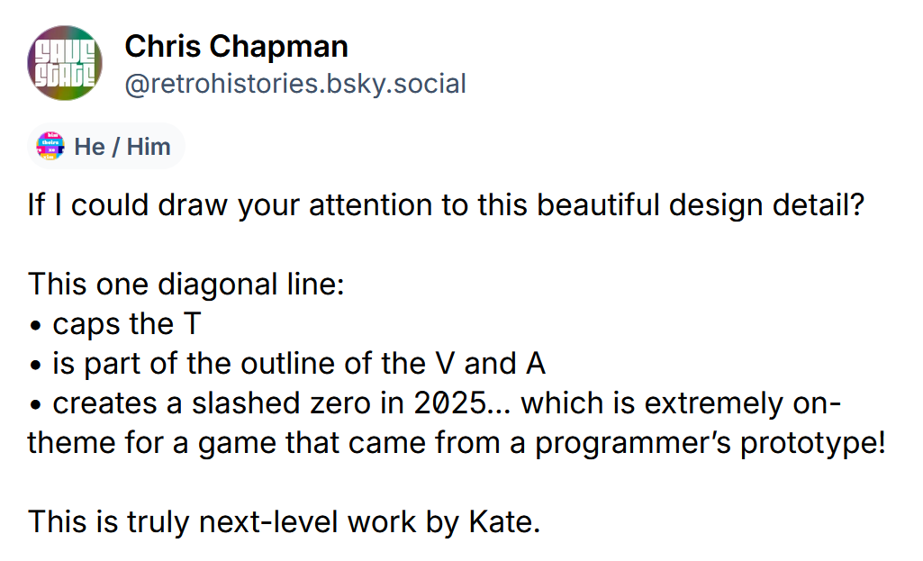
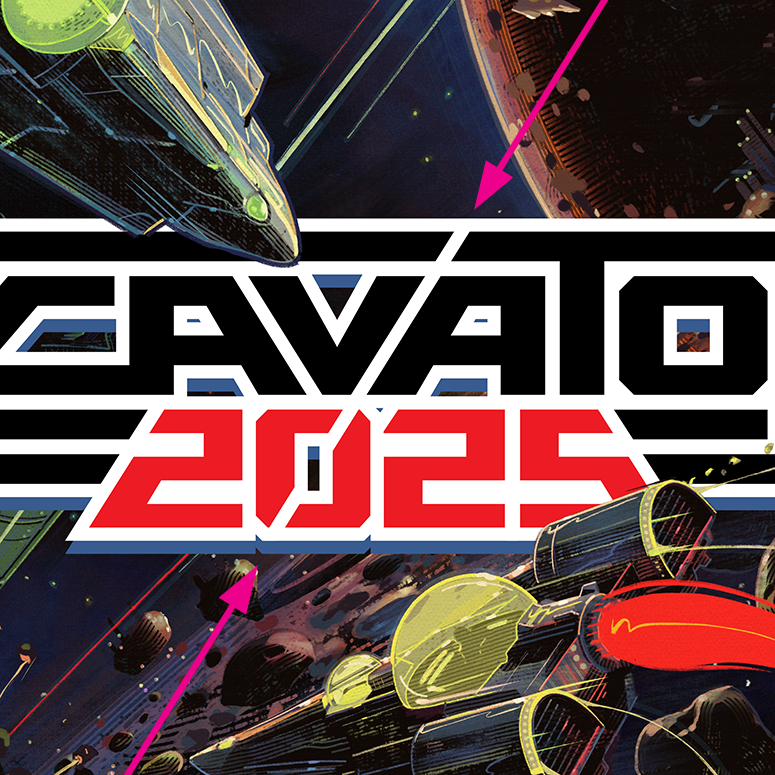
My goal with every design is to present a solution that looks so obvious that it looks like it arrived fully formed. But a great deal of work and thought goes into making something look this easy.
The process started back in 2021, when Frank Cifaldi of the Video Game History Foundation (or “VGHF”) approached me about designing the logo for this unfinished NES game that played like if the shoot-em-up (or “shmup”) genre had evolved out of Asteroids instead of Space Invaders, and included racing bonus levels after every stage. XCavator was creative, it was clever, and unfortunately, it also had a bit of a learning curve. Which is probably why it never found a publisher.
Frank has dumped and released his fair share of unreleased NES prototypes, but wanted to give this one the official release it always deserved, with the proceeds going towards the foundation’s preservation work.
I was his first thought for the logo due to my talent for channeling the styles of specific decades, as well as our mutual love of old X-Men comic books. Few people have spent more time thinking about and analyzing X-Men logos than I have, so being assigned a game called “XCavator” felt like the sort of thing I’d been training my whole life for.
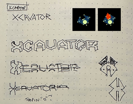
I like to do my initial brainstorming on paper. These aren’t the sort of sketches I ever show to clients, who’d likely be horrified by their looseness. It’s just an exercise for me to generate some initial ideas in shorthand for myself, before choosing directions to explore in Adobe Illustrator.
I felt that the unique shape of the mining ship used by the player had potential to be iconic, and because it looks like a “C” or half an “X,” I wanted to try incorporating it directly into the logo. I usually try to lock in a pure black-and-white design before I add color to ensure it’ll work in a limited color setting.
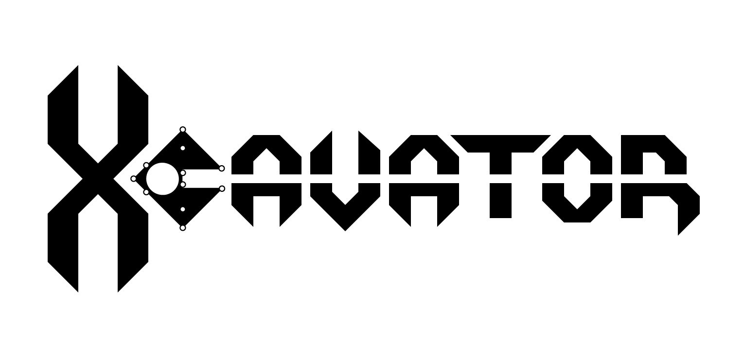
For Option #1, I started building a typeface based on the ship acting as a “C.” I like the idea of creating a sense of motion by having the craft’s exhaust cut through the rest of the word. I still like this idea enough that I'm sometimes tempted to add styling and color just to see how it would've turned out.
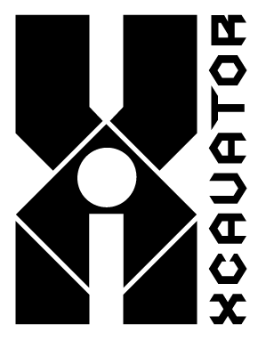
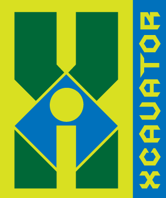
For Option #2, I built the ship into a letter “X,” and placed one of my other logo ideas along the side. In contrast the the more traditional look of Option #1, this option reflects the more adventurous design trends of the early '90s, the era when the SNES and Genesis were duking it out for cool points as the NES was winding down.
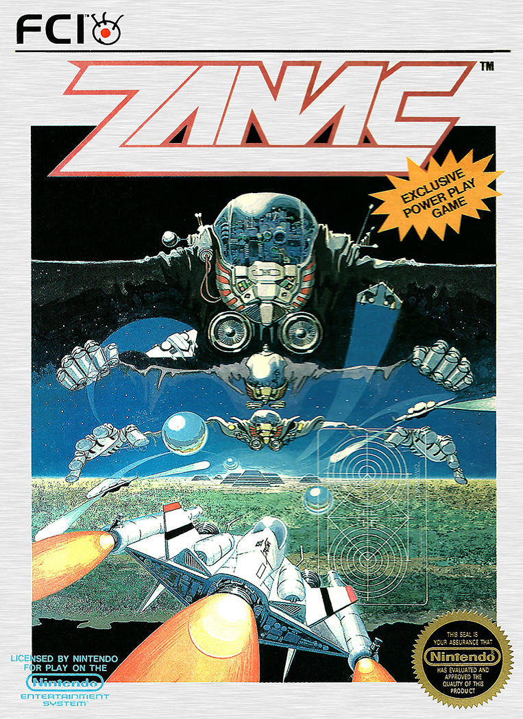
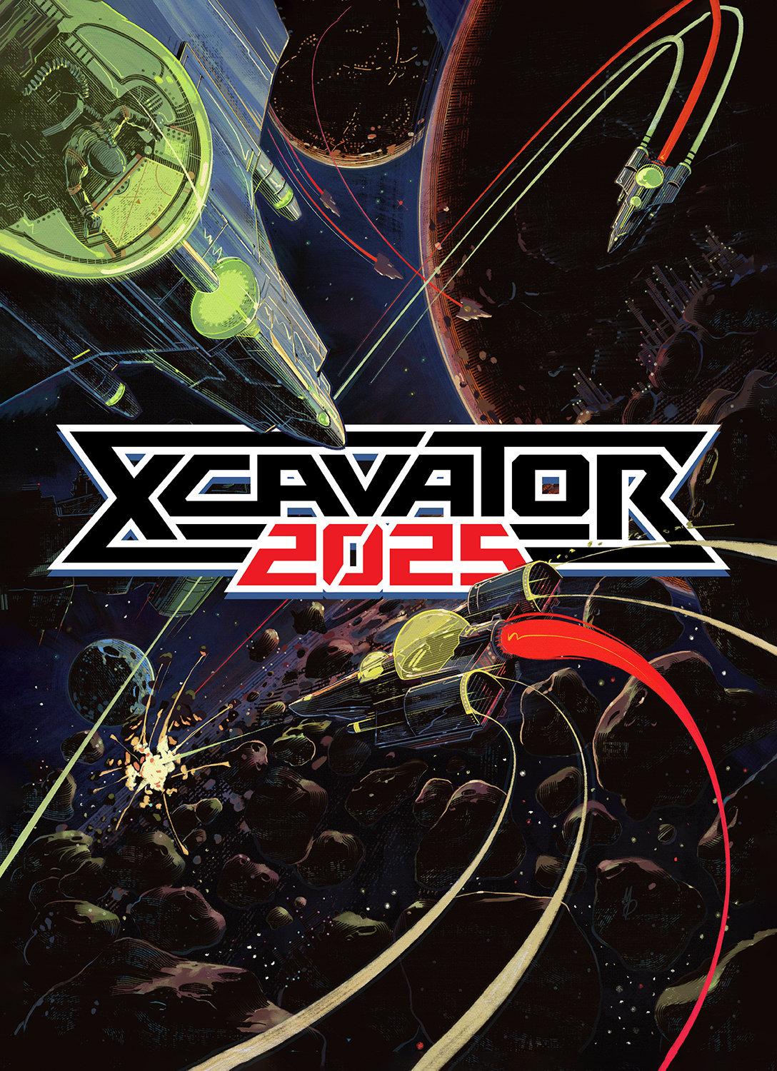
But then I saw the cover art Frank commissioned from frequent Lost In Cult contributor Marko Dosegovic (aka “Max58”), and I realized I had this all wrong.
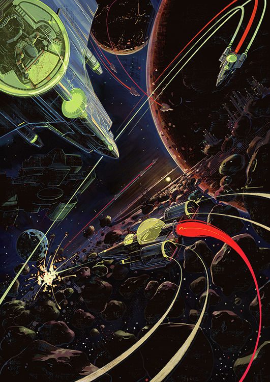
I’d been aiming for 1991-1993, but this depiction of one of the bonus racing sequences screamed for a design treatment that looked more 1988-1990, the era that NES fans get most nostalgic about.
The other consideration was where to put the logo. The most obvious spot looked like the bottom 1/4th, like a movie poster, except NES games didn’t do that. Most NES boxes place the logo at the top, with a small number placing it in the center, or sometimes along the side.
Frank wondered if we should set it inside a Konami-style border, presumably to make room for a logo, but I think I misunderstood the reasoning. Whenever I picture the Konami border, I’m not thinking of examples like Life Force where the art is contained within, but Gradius where the art bursts out.
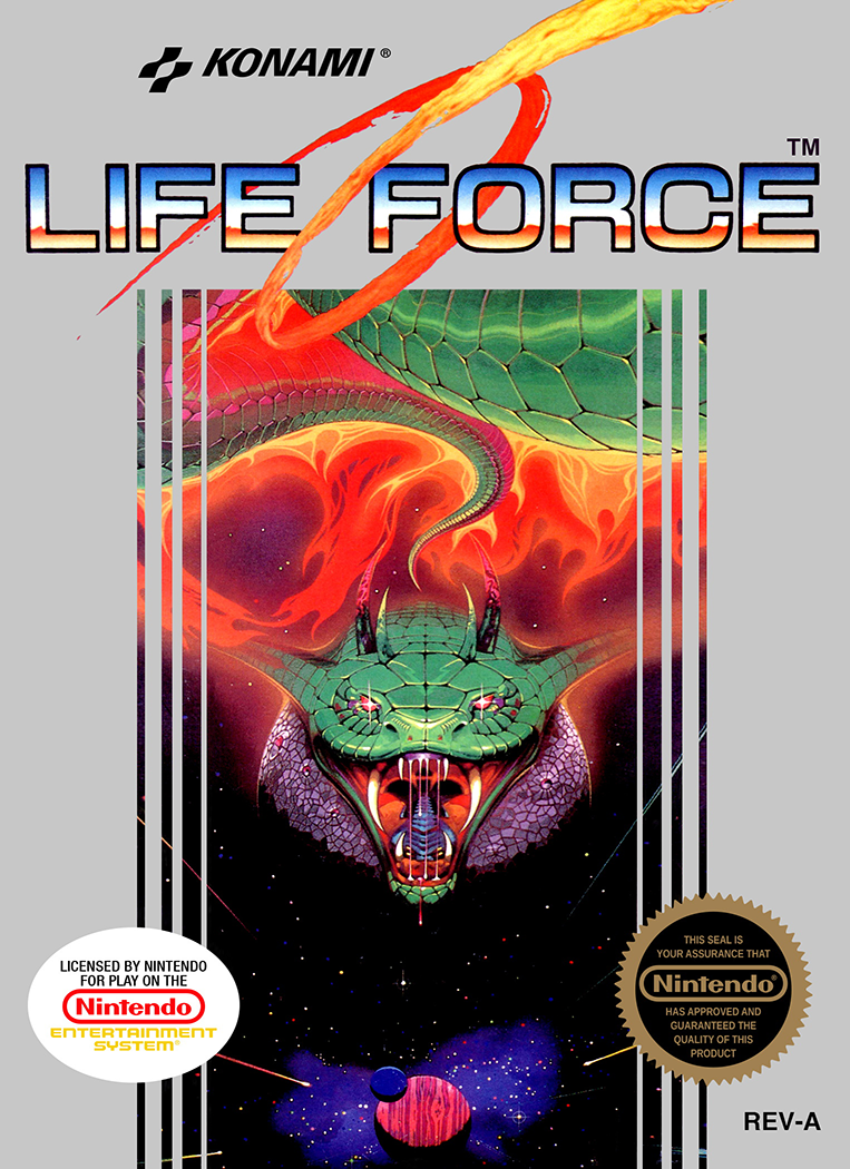
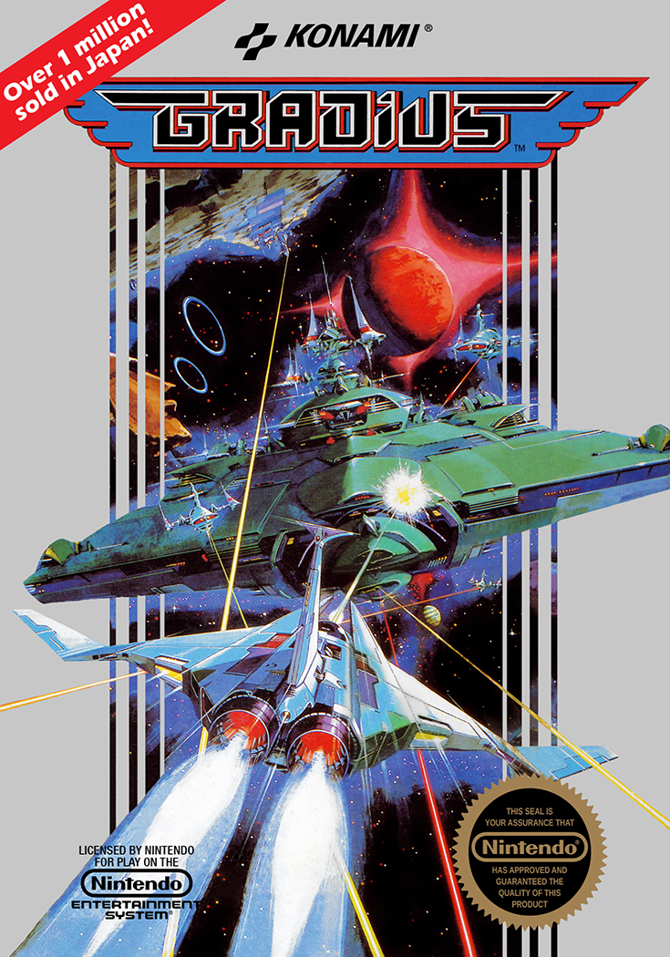
There’s this eternal battle between artists and designers, where designers treat art as texture for their design and artists would rather there be no text at all. I’m exaggerating a little, but I’m allowed to, because I’m both. Which usually allows me to find a nice middle ground, but sometimes the artist and designer sides of my brain fight.
In this case, the designer part of my brain was close to winning. I was like “Yeah, I should absolutely cover up half of the background so that the foreground elements have something to burst out from. Maybe the border should be a giant ‘X’?”
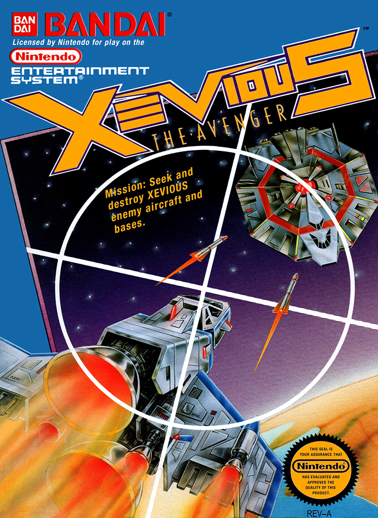
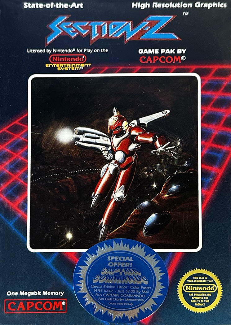
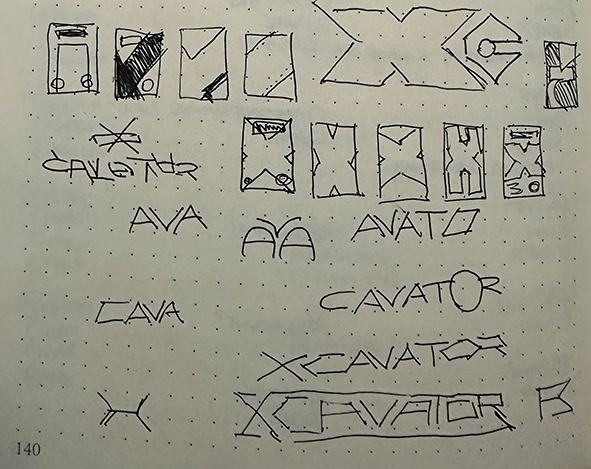
I also looked at non-Konami shmups, but more for the logos than the borders. I opened up my bullet journal and filled the rest of the page with new logo and border thoughts.
Then I fired up Illustrator and created a quick vector rendition of the logo, revising and refining until it looked like something that had always existed.
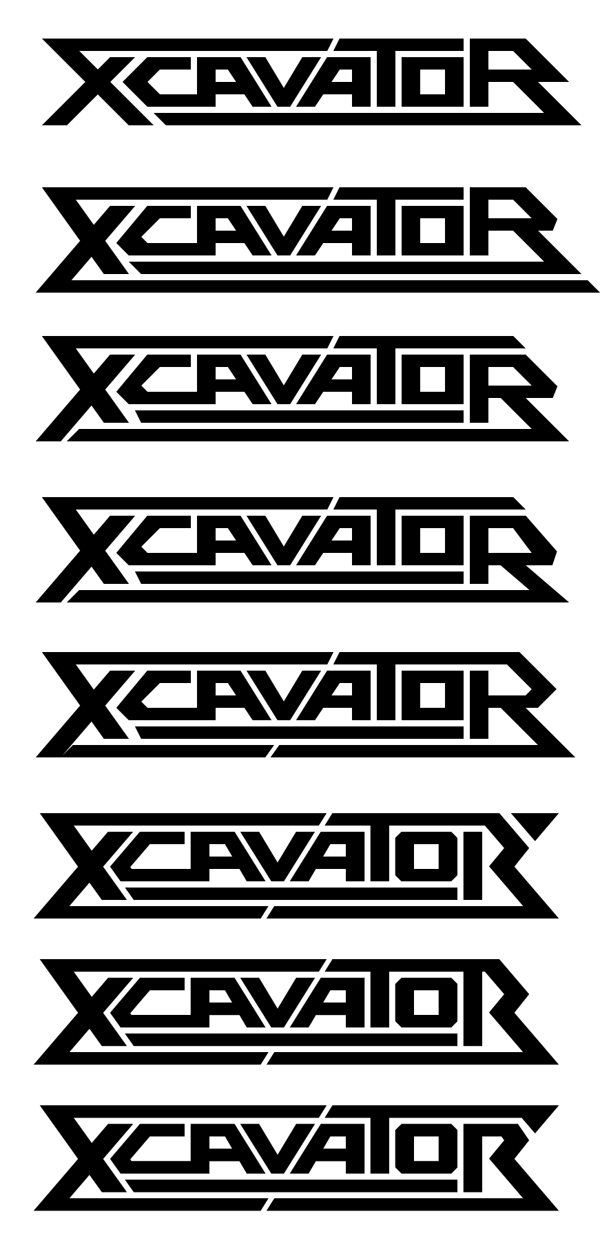
About halfway down you can see the moment where I decided the diagonal from the “VA” should continue into the bottom line. I kept the middle line whole so that it felt like puzzle pieces locked together. Also note the moment I realized the right side of the “R” should mirror the left side of the “X.”
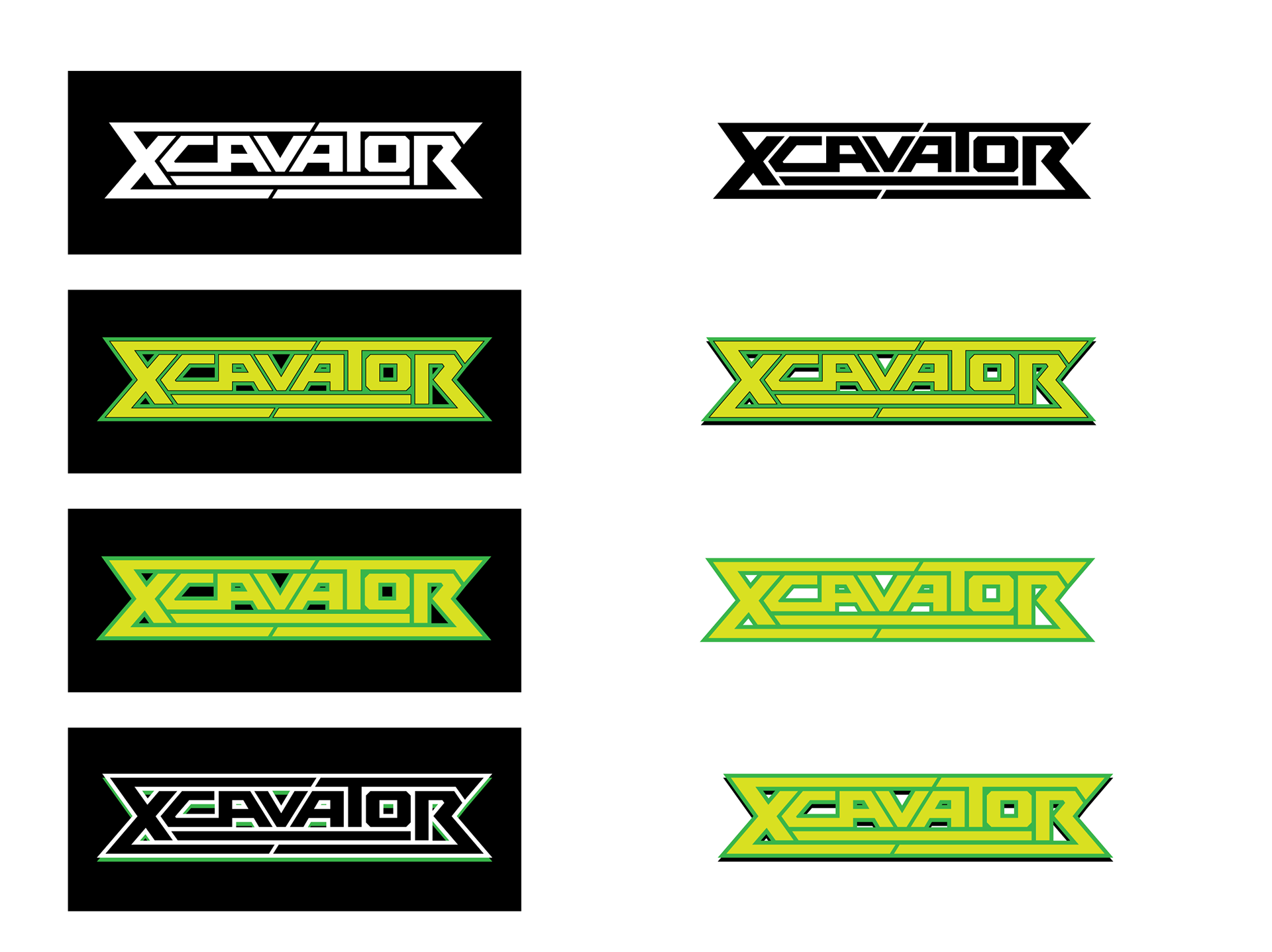
From there I started styling it, using a placeholder palette based on the green in the mining ship’s cockpit. This is the stage where the logo really comes alive. But before I could determine the final colors, I needed to figure out where I was going to slot this into the art.
If I’d seen a rough sketch of the art first, I might’ve suggested nudging the lower ship up so it was centered, and moving the big foreground ship to the lower right corner so I could place the logo across the top. Then I could have the smaller ship in the upper right corner look like it was zooming out from behind the logo.
This would have been a solid if unadventurous layout, and I’ll be the first to admit that the challenge of having the art already locked in led to a better solution.
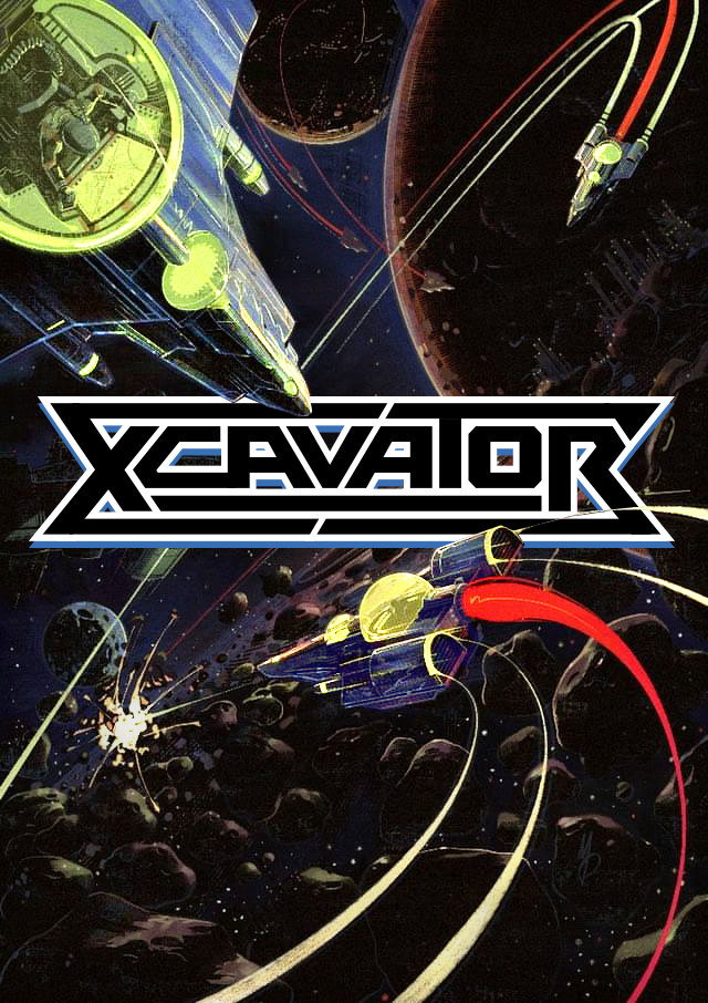
As I moved the logo around on the art, I realized there was just enough space in the center that maybe — maybe — I could wedge the logo in there. The ships could even overlap it slightly, and while it wouldn’t be quite as cool as if I could have that smaller ship flying out from behind it, I liked that it felt like the upper two ships were pointing at it.
In terms of the color palette, I discovered that the best way to make the like “pop” against the dark imagery was, counter-intuitively, to fill the logo with black. White outlines on black, and a subtle drop shadow in the same blue as the foreground ship.
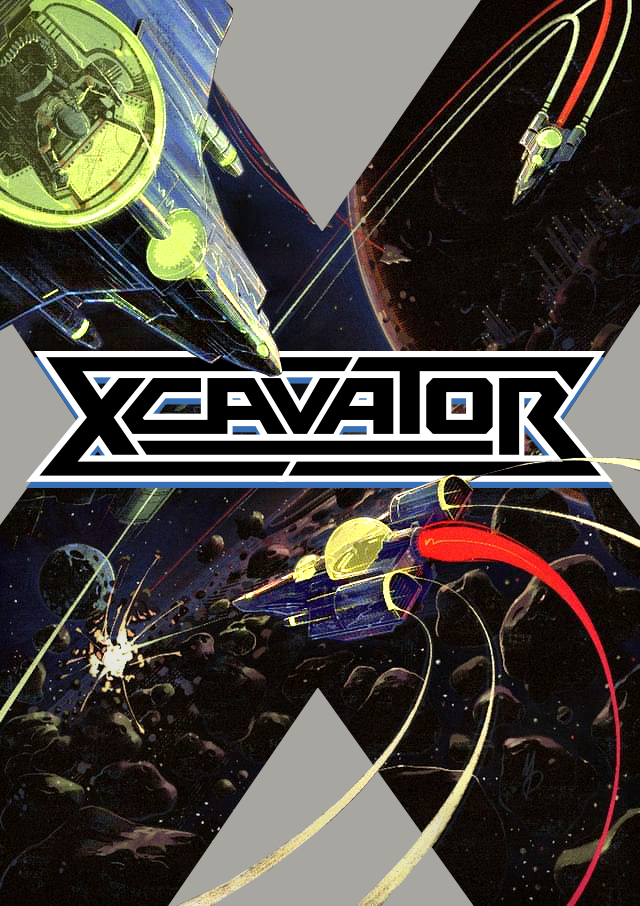
It’s at this stage that I realized I could build a giant “X” border that would hug the indents of the logo. The border also broke the image into four quadrants, each with something interesting happening for you to look at. Designer brain patted itself on the back for how extremely clever this was.
But Frank preferred the first design, because it covered up less of the art. Designer brain wanted to defend the design’s cleverness — the cleverness! — but artist brain was in complete agreement.
Time goes by, and Frank has a thought. He thinks we should modify the title in order to differentiate this finalized game from the original unfinished prototype. Could I add the year “2025” to the logo somewhere?
Some designers might silently balk at such a request. “I carefully fit all these pieces together like a puzzle, and now there are new pieces?” But in this case, I’d always felt like the logo was somehow incomplete. I couldn’t put my finger on it, but it was missing something.
I was prepared to agonize over this revision for days, but instead it clicked within hours.
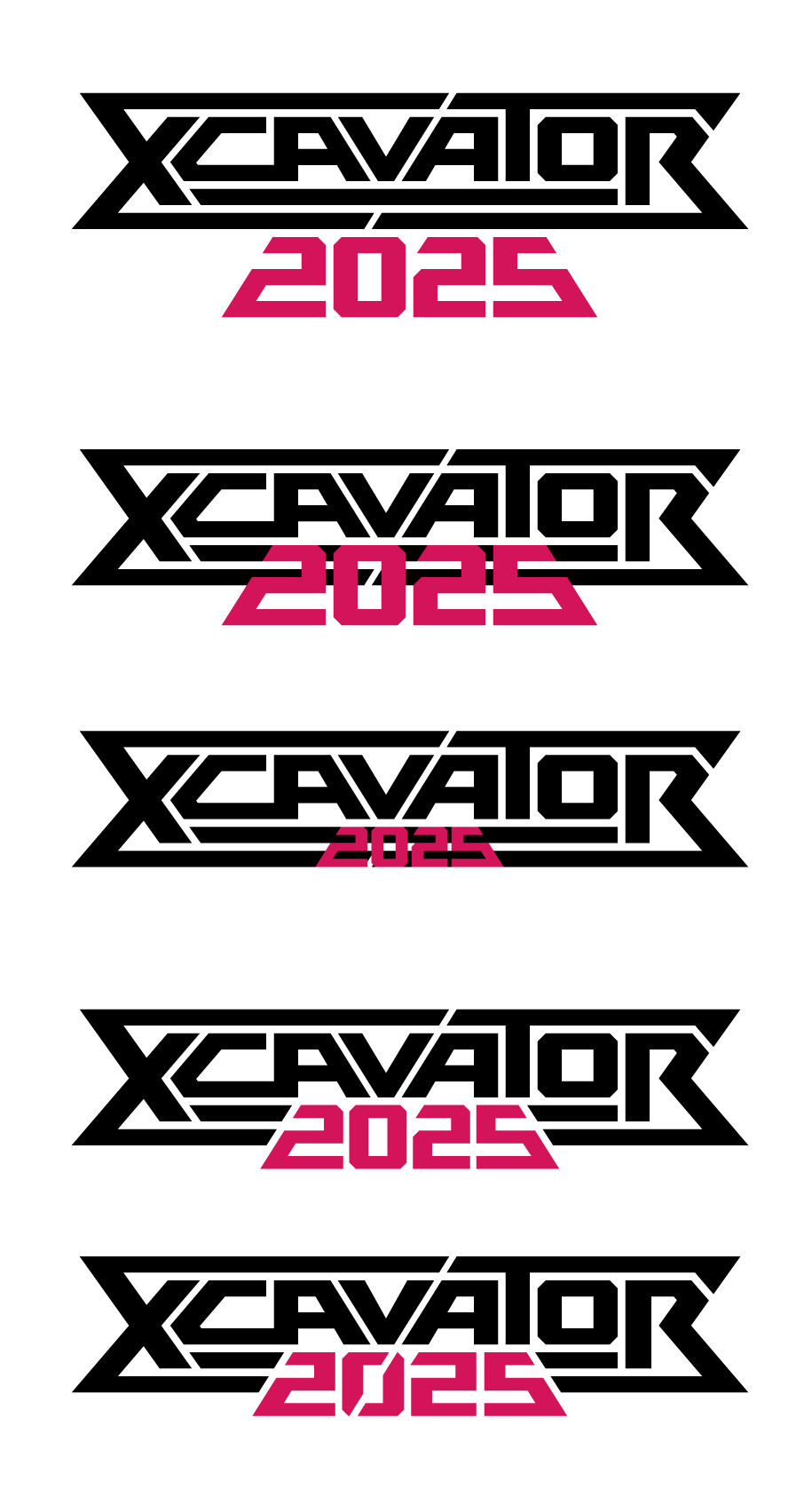

I may have started out by sketching the shape of the year on the back of an envelope, a bad habit that results in old sketches being more difficult to locate after the fact. I made it red like the ship’s exhaust because I felt like it should jump out rather than blend in, and that was just the piece it needed to feel complete.
Except I was initially worried that it was going to completely ruin the cool diagonal line I had going. But you can see the moment at the very end where I realized, “Holy shit — it can cut through the zero, just like the Broderbund logo!”
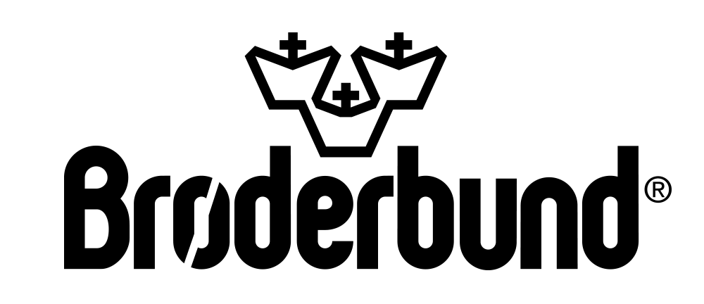
Broderbund was a computer game publisher best known in the late ‘80s and early ‘90s for titles like Where In The World Is Carmen Sandiego?, Prince Of Persia, and MYST.
I fired the revised logo off to Frank, who likely wasn’t expecting to see it so soon. “Oh wow I love this,” he DM’ed back. “The diagonal line is so good!”
But this is only half the story. Read about how the rest of the packaging came to be.